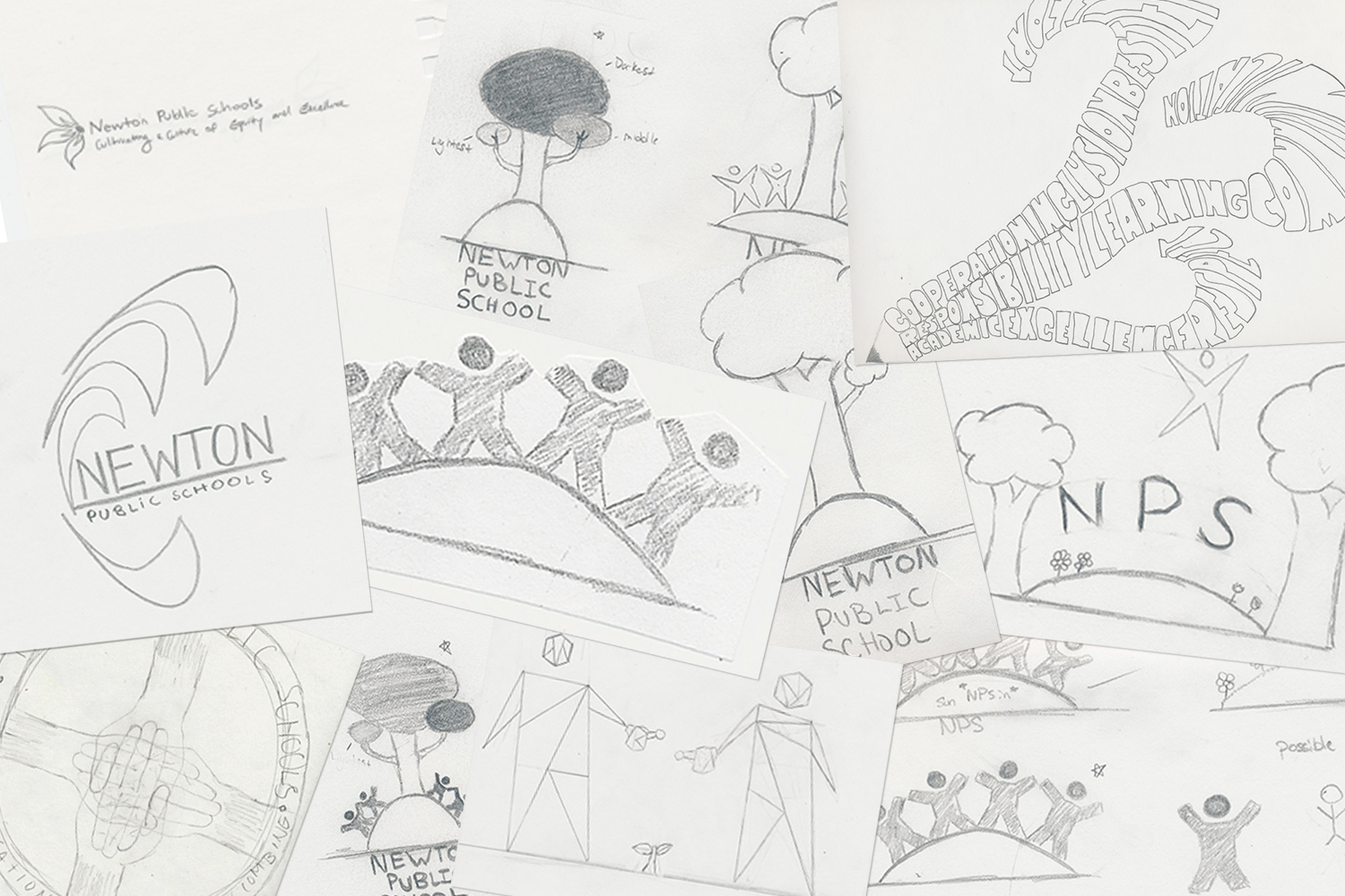
Last year, Major 2 helped rebrand the Newton Public Schools. Before, the school system only used the city seal to represent itself, and the branding was kind of muddled. To help them, we spent the majority of the year working on this project. The process was broken into six phases that helped facilitate t
he creation of the new logo: branding research, market research, design, branding proposals, pattern research, and final logo design. Rebranding an entire system is not just drawing a logo. It is a lot of hard work studying the messages that want to be conveyed and the influence the brand will have on the community.
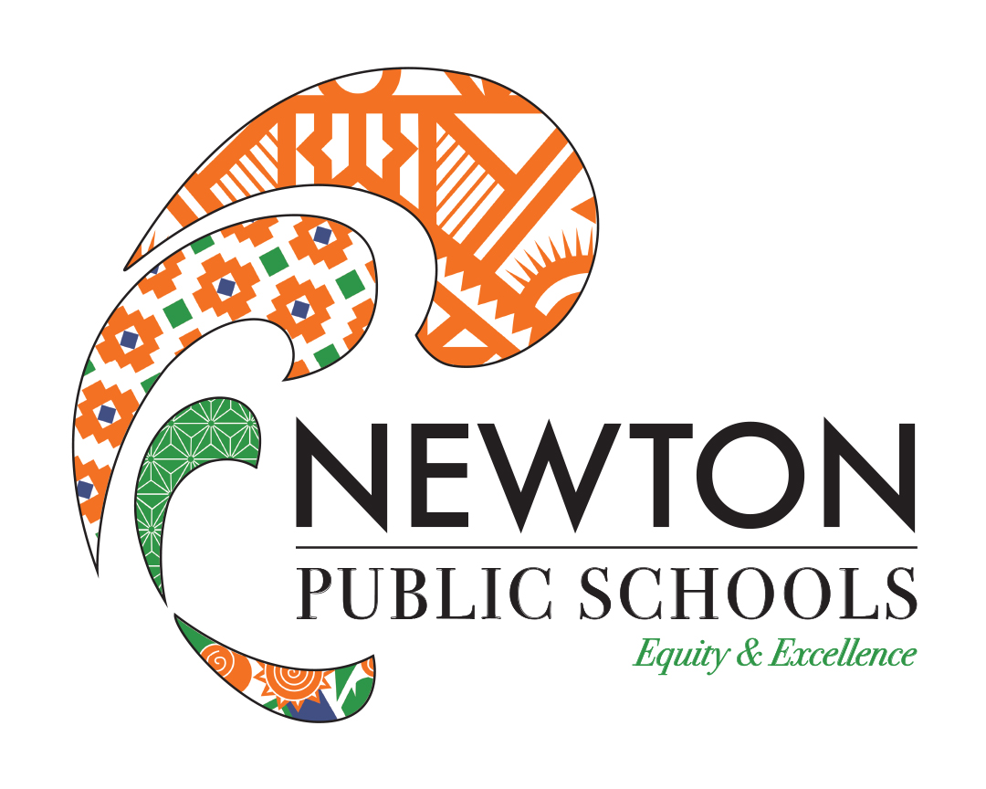
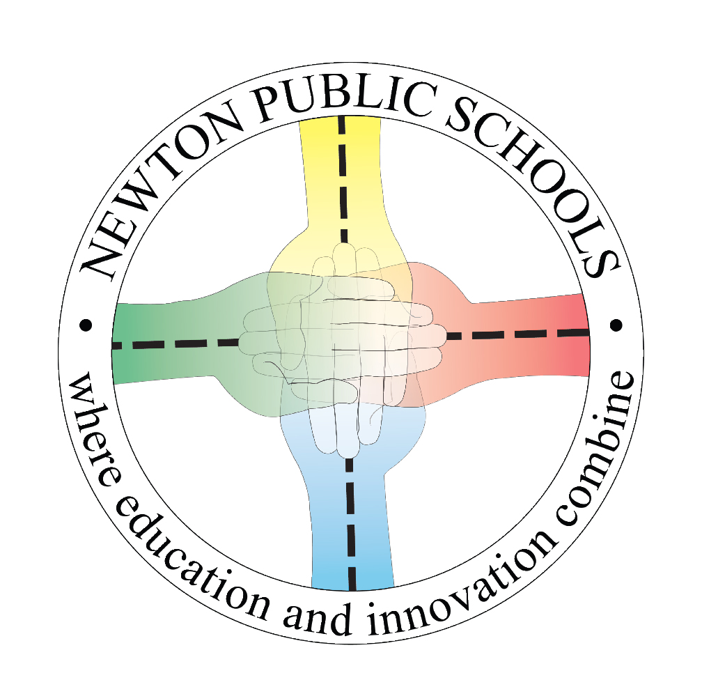
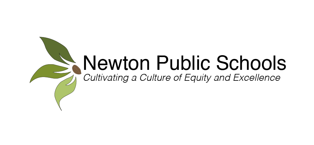
We looked at other school systems for inspiration and decided on creating Arthur’s logo with different aspects of the culture in the Newton Public Schools. When making the actual logo, we had hundreds of drafts in color and in black and white to illustrate how the logo would play out in the future. However, this proved to be far too complex to display on a small scale, such as on the mobile app, and after multiple meetings with faculty of the Newton Ed Center, we chose to pursue Li’s idea, a more simplistic logo with three leaves and a seed.
Now, this image is all over Newton, including the NPS app, the school district website, letters sent home to Newton families, and even the students’ Google Docs pages! It’s great to see all the hard work we put into the year pay off!